Off Book by PBS

After being all gung-ho on starting homework on Monday, I think I overdid it a little and messed up some muscles in my neck. I don’t remember inking being so hard… body, y u hate me? ;_;

So as I sit here smelling of bear balm with a heat pack on my poor neck, I thought I’d take a minute to share something really cool I stumbled upon through twitter- wait, maybe it was reddit… or was it tumblr? I think I have a slight social media overload going on here. Anyway, PBS’s Off Book is a series of videos about art and design related goodies. The only two I’ve seen so far are embedded below, but there are a handful of others I’ve yet to watch (since I have to get homework done at some point).

After watching this, my love for illustration was renewed! As I’ve progressed through school so far, I’ve been trying to soak up as much information as possible on fine art and illustration careers. The line between them is not as blurred as I thought, it goes much deeper than originality versus commercialism. I haven’t really made up my mind on which one I’d like to pursue over the other, and this video made it a bit harder. I was initially leaning towards fine art because I wanted absolute freedom of expression. However, listening to artists talk in this video about how being unique is so valued as an illustrator these days, and seeing some of the amazing works presented, it looks like I’d have more freedom with illustration than I believed.

I’ve found myself giving fan artists a bit of a hard time lately (in my head mostly). It seems too easy to take someone else’s character idea and put a face to it in exchange for fanboy’s/fangirl’s money. This video has softened me a bit to it, though I still prefer original work. The sense of humor and community in fanart is hard to match and certainly something I participate (ie: lurk) in with my favorite shows. As a bonus, there’s a short interview with Sam Spratt, a digital artist I’ve fawned a bit over.

Alright, I’m almost through my second coffee of the day and need to get back (no pun intended) at it. I’m hoping that I’ll be able to finish up homework by Friday, since I’ll be visiting home over the weekend to touch base with family. With any luck and lots of frequent breaks, my neck will be back to normal by then. Cheers!

Jumping Into Digital Art

A few days ago (on a Wednesday night, surprisingly) my new Wacom Create tablet showed up! Once it was installed I had to give it a test run:

Wacom Doodle

Wacom Doodle

This tablet has pressure sensitivity, but unlike the Cintiq I had access to earlier this year, it doesn’t detect tilt-motion from my wrist. To be honest, so far I don’t miss that aspect of the tablet, and really love how lightweight and mobile it is. I don’t even mind the fact that it’s not wireless. It feels very similar to what a sketchbook is like, and instead of hunching down over it, I’m looking up at a screen.

I’ve been trying to gather resources to build a nice “digital workspace” for myself. This includes going through the art magazines I’ve purchased over the last few years and copying the resource CDs that came with them, to scour them for content. Many magazines, ImagineFX in particular, have downloadable tutorials and brushes in each magazine. Every so often they’ll have some really beautiful art inside and I’ll pick one up. Now, I have a chance to take advantage of the Photoshop brushes and tutorials they offer.

While going through one of the tutorials, I learned that some artists use 3D software to simulate models to use as reference. What a brilliant idea! My next thought was, what software should I use to do this? 3D software can get pretty expensive and can be very complicated to learn. After some research, I came across the Daz 3D Studio software. To my surprise, it is freely and legally available right now! This will be hugely useful when trying to come up with realistic lighting and anatomy references! I was skeptical at first since it seems too good to be true, and was afraid it would end up being trial software, but found an article explaining why the devs decided to make it free. They have customization packages that you can buy to add-on to the software, but on its own it’s more than enough to give me anatomy reference. They have landscape modelling software I’m going to look at as well.

This brings me to the next part of the workspace: software. There are so many programs out there for digital artists, so which one is the best? The answer to this greatly depends on what kind of art you like to do, and who your audience is. While I was researching different software online, including Corel Painter and Easy Paint Tool SAI, I found this Fur Affinity forum thread. A user by the name of Arshes Nei compares sketching and painting in 6 different pieces of software, results shown below. It’s highly educational and totally worth checking out!

Apple Still Lifes by Arshes Nei

Apple Still Lifes by Arshes Nei

Paint Tool SAI has become very popular as of late because it’s a lightweight piece of software (in comparison to Photoshop and GIMP which can be resource hogs, and slow down your computer) and is relatively easy to find. I’m going to play around with that a bit, keeping in mind that when I eventually get a Macbook (way down the road when I stop being a poor art student), I’ll have to switch to something else since there’s no Mac version.

Armed with references and painting software, I should be ready to go! I was drawing in my sketchbook when the tablet first arrived, so I may start off by translating the sketch to the laptop…

I’ll end this post with my Foundation Computer final project. We used Adobe Illustrator frequently in that class and I fell in love with vector drawing. Our final project for the class was to do an animation, any way that we wanted. I used Illustrator to draw the frames and put them together in iMovie. I recommend watching it in the highest resolution available on Youtube’s website. Enjoy!

Tutorial by Rob Sheridan and the Issue of the Chuck Close Filter

Short entry today, because I a) have been trying to sort out moving-related stuff and b) need to keep working on my first paid commission! May show some teasers soon but it’s supposed to be a surprise so I’ll have to be a ninja about it.

Clicking the image below will take you to a digital coloring tutorial by Rob Sheridan for his piece, “Mascots”.

"Mascots" by Rob Sheridan

“Mascots” by Rob Sheridan

The tutorial is mainly Photoshop-based and very thorough; he talks about how he got the textures in the wood paneling of the walls as well as the dingy old carpets. His attention to detail is pretty amazing. For example, he drew, from scratch, the labels on the beer cans by researching old labels from the 70’s and redrawing them vector-style. For the magazine cover and the playing cards, he found high-res scans (or scanned them in himself) and warped/yellowed them to look appropriate. I like this tutorial because he really takes advantage of Photoshop for digital artwork by using tools like the perspective tool and the many filters that come standard with SP. Very inspiring work, must have been painstaking; totally worth it though, looks fantastic!

I came across an article on my feed yesterday titled My Chuck Close Problem by Scott Blake. The article describes a project (coded by Blake) that essentially recreates Close’s style in a program accessible online through a web browser. You’d submit a photo and get it back Chuck Close-ified. Blake is/was very proud of this project and a huge fan of Close. Unfortunately, when it became popular Close demanded that Blake take it down. It’s worth taking 15 minutes or so to read through the article for more details.

Scott Blake Self Portrait (via Hyperallergic)

Scott Blake Self Portrait (via Hyperallergic)

The website was free to use, so Blake wasn’t making any money off of it. Nevertheless, Close claims that Blake was “devaluing” his work. On the one hand, I can understand where Close is coming from. No one wants to have their style (in Chuck’s case, something extremely personal to him, developed over many years because of his physical condition) copied and used in ways they can’t control. On the other hand, nothing made with this “Chuck Close filter” will ever be as good as what Close does himself. The program uses already-painted squares from previous paintings and rearranges them to mimick the photo. Anyone familiar with Close’s work knows that his process is much more involved than simply gridding out a portrait.

It’s a tricky subject and I’m not quite sure which side I come down on. A lot of the comments on the article criticize Blake for spending so much time (10 years!) on a project that’s based so heavily on another artist’s work. Even though Blake put a ton of effort into this, I’m leaning towards agreeing with these artists. It’s fine and dandy to spend time on fanart, or studies or copies of other work, but in order to be successful as an artist you need to try and come up with, and explore, original ideas. Blake argues that he’s taking Close’s work in a different enough direction but I have to disagree there.

Either way, the article brings up an important discussion about what constitutes copying, and about stealing/borrowing/building off of someone else’s idea; at what point does it become your own?

Burlesque Manga Illustrations by Matsuo Hiromi

Manga-inspired illustration continues to impress and inspire me. Thanks to Tumblr, a great source for illustration from all around the globe, I was able to find Matsuo Hiromi.

by Matsuo Hiromi

by Matsuo Hiromi

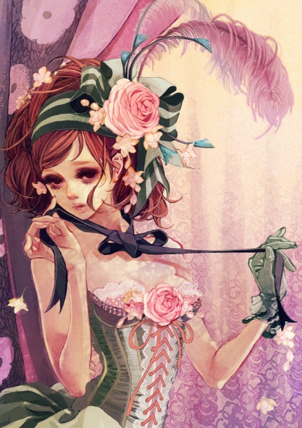
Manga-heavy with a splash of Mucha and Art Nouveau, Hiromi’s art is classy, frilly, stunningly elegant. Though I’m fairly certain it’s digital , it has a very traditional feeling to it, through use of soft water-colors and textures.

by Matsuo Hiromi

by Matsuo Hiromi

I love that she’s taken extra time to focus on the little details in her clothing and jewelry. My eye is drawn to so many elements here; her whimsical curly hair with purple peacock feathers, the jeweled drop necklace, her layered lacey top, the delicate rings on her fingers, the criss-crossing lace on her leggings… everything was painstakingly thought out and beautifully rendered.

by Matsuo Hiromi

by Matsuo Hiromi

Hiromi’s sense of fashion and style is astounding. The dresses she comes up with are absolutely gorgeous and have amazing textures: silky, frilly, pleated, you name it. The accessories and hair on her subjects always complement their outfit. The background here is pretty as well, rendered in warm purples and yellows to bring out the soft greens in her corset and gloves.

by Matsuo Hiromi

by Matsuo Hiromi

All of her women have soft dewy eyes, windswept expressions drawing you further into their world. Her grasp of nature and architecture on top of fashion is really astounding. Having  the rigid structure behind her contrast with the flowing soft flowers provides a beautiful contrast and really shows off her skills.

by Matsuo Hiromi

by Matsuo Hiromi

The art nouveau elements in her style really help frame her characters and give a classy edge to the work. Just as much attention is given to clothing, furniture and backgrounds as is given to the girl here.

by Matsuo Hiromi

by Matsuo Hiromi

Her color palettes are soft, luscious, warm and inviting, reminiscent of spring and summer. They look slightly yellowed and vintage, as if the viewer is remembering a dream or a party from long ago. By using outlines in different colors than black, such as brown and pink, or by leaving them out all together, her dreamy colors are really able to shine.

by Matsuo Hiromi

by Matsuo Hiromi

Her work looks like it gets published a lot, both through books and products. I won’t lie; if I saw her illustration on a package of eyeshadow I would be strongly inclined to buy it! You’re welcome to visit her website, though it may be a bit tricky to navigate since it’s in japanese. Unfortunately, I’ve been unable to find an english source to purchase any of her work and it doesn’t seem to be available through amazon.com/ca, either. If you’d like to see more of her work, you can search for it through tumblr or visit a mirror of her work here.